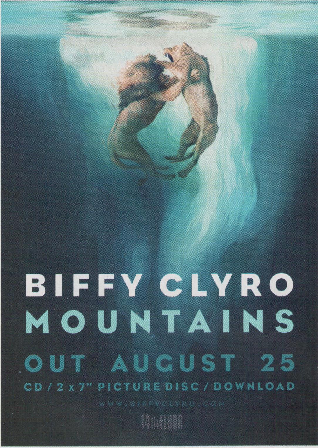
As you can see this ad is very basic, it lacks some of the main codes and conventions I have recently blogged about. However, it is very powerful in the way it uses the bold colour blue which is the prominent colour. This colour could signify calmness however the image reflects on a more viscous aspect, relating to the alternative rock genre.
Your eyes are instantly attracted to the text 'Biffy Clyro' through the use of a different colour in comparison to the rest of the texts. This is used well to promote his new album through when people are flicking through the magazine, the name of the artist is obvious. The realise date is clear through the use of a bold and large text, this is also used to promote the album name.
Although the magazine ad is fairly simple, we could use it when making our second design for another magazine genre pacific. Because the imagery and text doesn't fully emphasis's the genre of the band.
No comments:
Post a Comment
Please ensure that any comments are relevant to the information or post on my blog.